CHARTS
Top 3 Excel charts to report like a professional
If you need Microsoft Excel Charts then you must know what the top 3 most used Excel chart types are. Here we will make a comparison of all chart types and pick the mostly used ones.
Below you will find our Microsoft Excel Charts infographic which presents all chart types in one place. Some of them are more frequent in use by the majority of users. They are usually appropriate for general data visual representation. On the other side there are some more specific, and they require from you to carefully prepare the data sheet in order to use them.

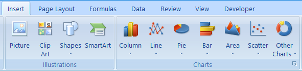
So, as you can see, there are seven categories of chart types:
- Column
- Line
- Pie
- Bar
- Area
- Scatter
- Other charts
Each of them you can find if you go to Insert tab, and there you will see a group called Grafikoni with the list of these seven chart categories. When you click a down arrow for each chart category, you will be able to choose among different chart styles in it.
Which chart type is most appropriate for your data?
Depending on the data you have in the table, you will choose a chart type that fits the best. Let’s think about one example.
If you have sales data presented by 12 months, then it would be very easy to choose among different chart types. You could choose a Column, Bar or Line chart type. On the other hand, if you have stock price change data, then you would probably choose Stock chart which is inside the Other charts category.
Very often we want to show the data as a percentage of total. On that occasion Pie or Doughnut chat is the best choice. Doughnut chart is also inside the Other charts category.
Top 3 chart types for reporting
Majority of people would use Column, Line and Pie chart types for their data.
This is not a surprise having in mind that a great percentage of the data which people need for charts is very simple and easy to use with these 3 types.
You can also combine multiple chart types inside the same chart. In that way users diversify their data, and make them more appealing to readers of the chart. When talking about chart types combinations, Column and Line are most frequently combined together.
Many reports, especially financial reports, include charts. Often multiple charts are shown together in a single report in the form of a reporting dashboard. In this way big amounts of data are analyzed from different points of view with keeping simplicity in every single chart.
If you need some additional advice or consultation related to charts, please be free to write to us your issue or question. We are glad that we can be of service.